

TREATMENT DESIGN 1.0
Formatives
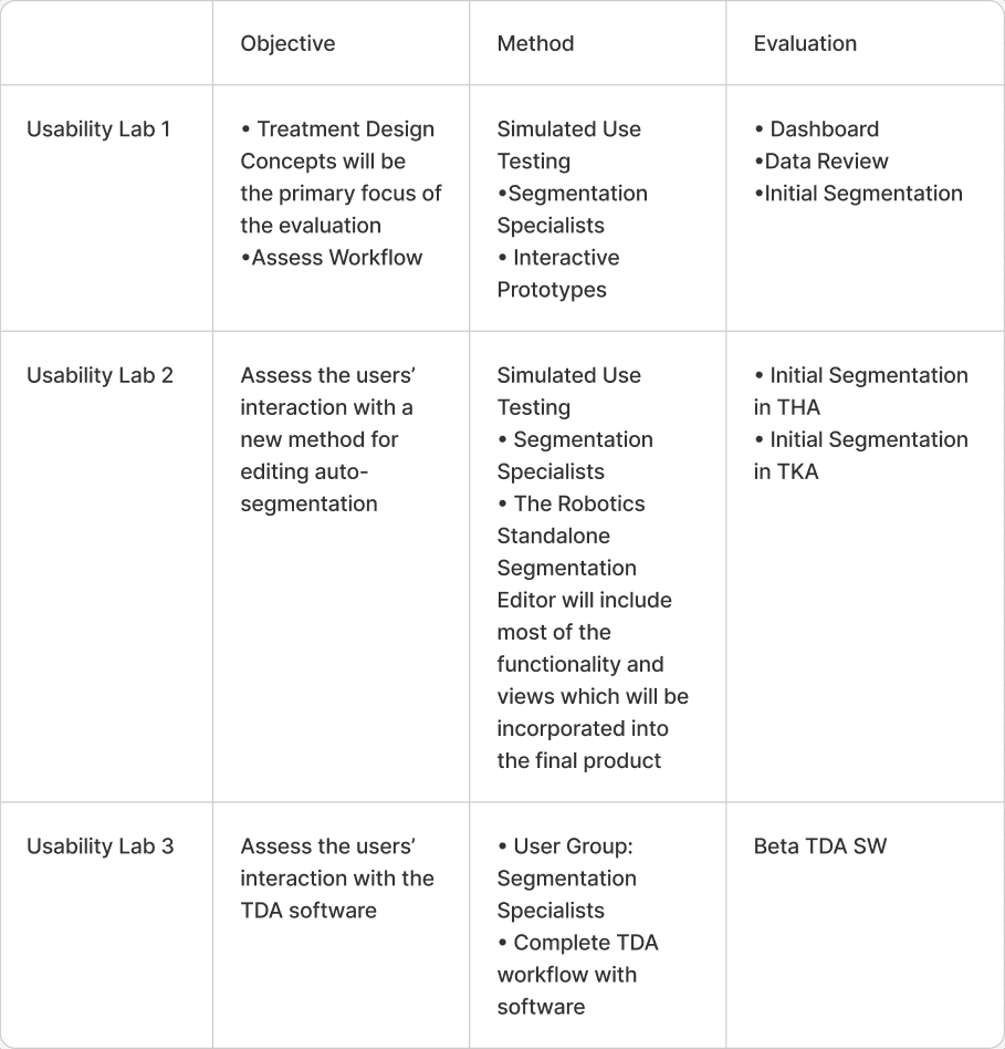
Evaluation I
Use Environment
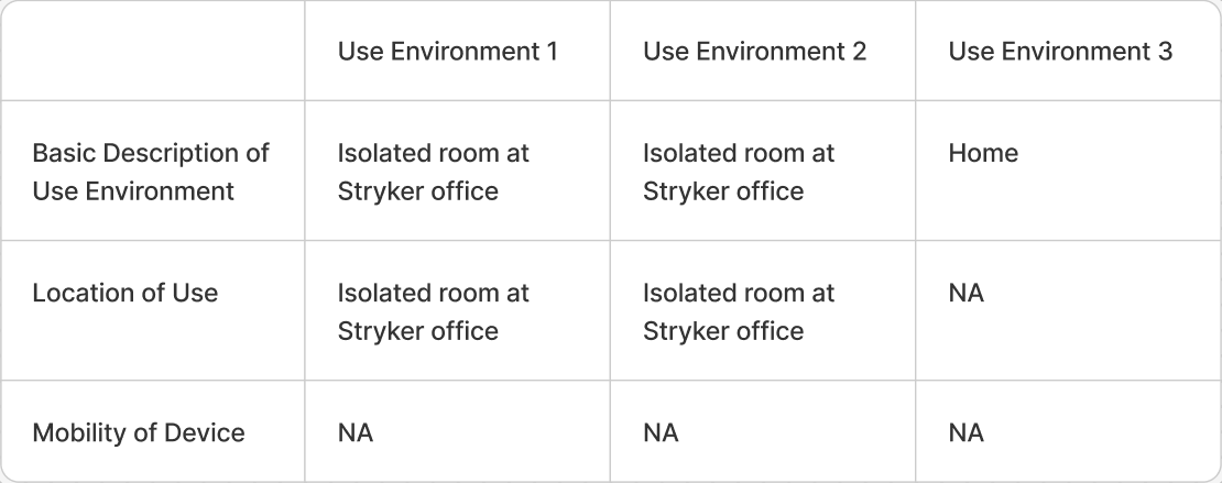
Context of Use
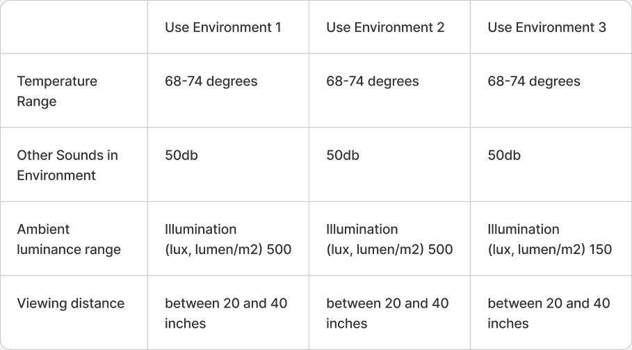
summery
The intended path of the Dashboard and Data Review sections of the TDA.
Data was collected with the use of:
• Likert Scale ratings from 1 to 7
• Observational Task Analysis
• Structured Questions
• Unstructured follow up questions
Documents
• Use Specification
• Intended Use Portrayal
• User Interface Evaluation Plan
• Task Analysis
• pFMEA
• Product Risk Table
• Formative Evaluation Protocol
participants
• 2 THA Segmentation Specialists
• 2 TKA Segmentation Specialists
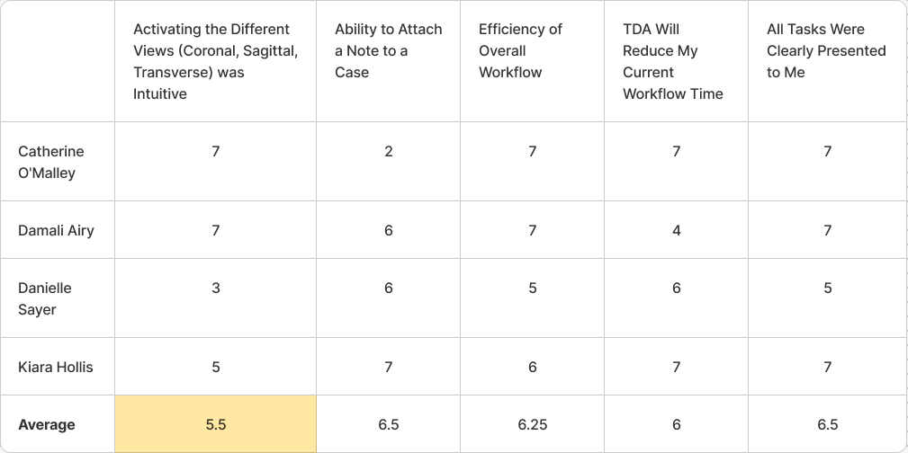
Lykert Scale

scenario 1
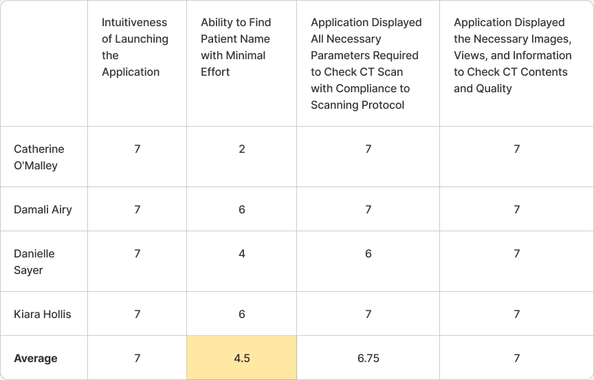
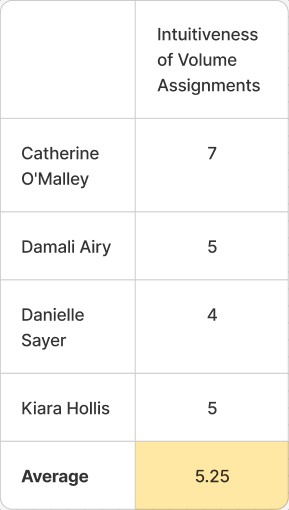
scenario 2
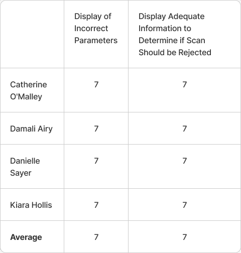
scenario 3
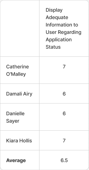
Scenarios 4
Feedback
Patient Name Search: Difficulty in finding the desired Patient Name due to combined THA and TKA cases and lack of alphabetization.
Notes Interface: Concern about the notes box covering the Patient Name; suggestion to have the note box above the Patient Name.
CT Volume Management: Desire for the ability to drag CT volumes to reassign them.
View Transitioning: Initial difficulty in transitioning between Coronal, Sagittal, and Transverse views due to familiarity with Mimics; now understood.
Dashboard Filtering: Importance of being able to filter by Hip and Knee on the Dashboard.
Connection Loss Indicator: Red bar indicating loss of connection to the database is not intuitive; suggestion to consider a pop-up notification.
Data Review Simplification: Suggestion to simplify Data Review CT scan parameters using a carrot (^) to access additional information.
Button Design: Recommendation to make buttons more identifiable, possibly by adding a 3D effect or raised appearance.
Parameter Visibility: Suggestion for larger or bolder text for failed or incorrect parameters.
Patient Name Format: Preference for viewing Patient Name as “Patient Last Name, Patient First Name.”
Drawer Functionality: Drawer for additional information is initially non-intuitive but becomes easy to remember after use.
Keyboard Shortcuts: Need for keyboard shortcuts, possibly similar to those in Mimics.