Proscia’s NVS ROAD MAP


alignment in taxonomy
First steps in product unification
Clinical (Ap & Dx)
For the clinical application, the site’s taxonomy was thoughtfully balanced. Key areas such as workflow support, user preferences, and admin access were easily and intuitively accessible, which significantly reduced clutter on the main page. My vision for the UI was to remain unobtrusive, allowing functionality to unfold seamlessly in response to the user’s needs—quickly, efficiently, and with intuitive precision.
Research (Life Science)
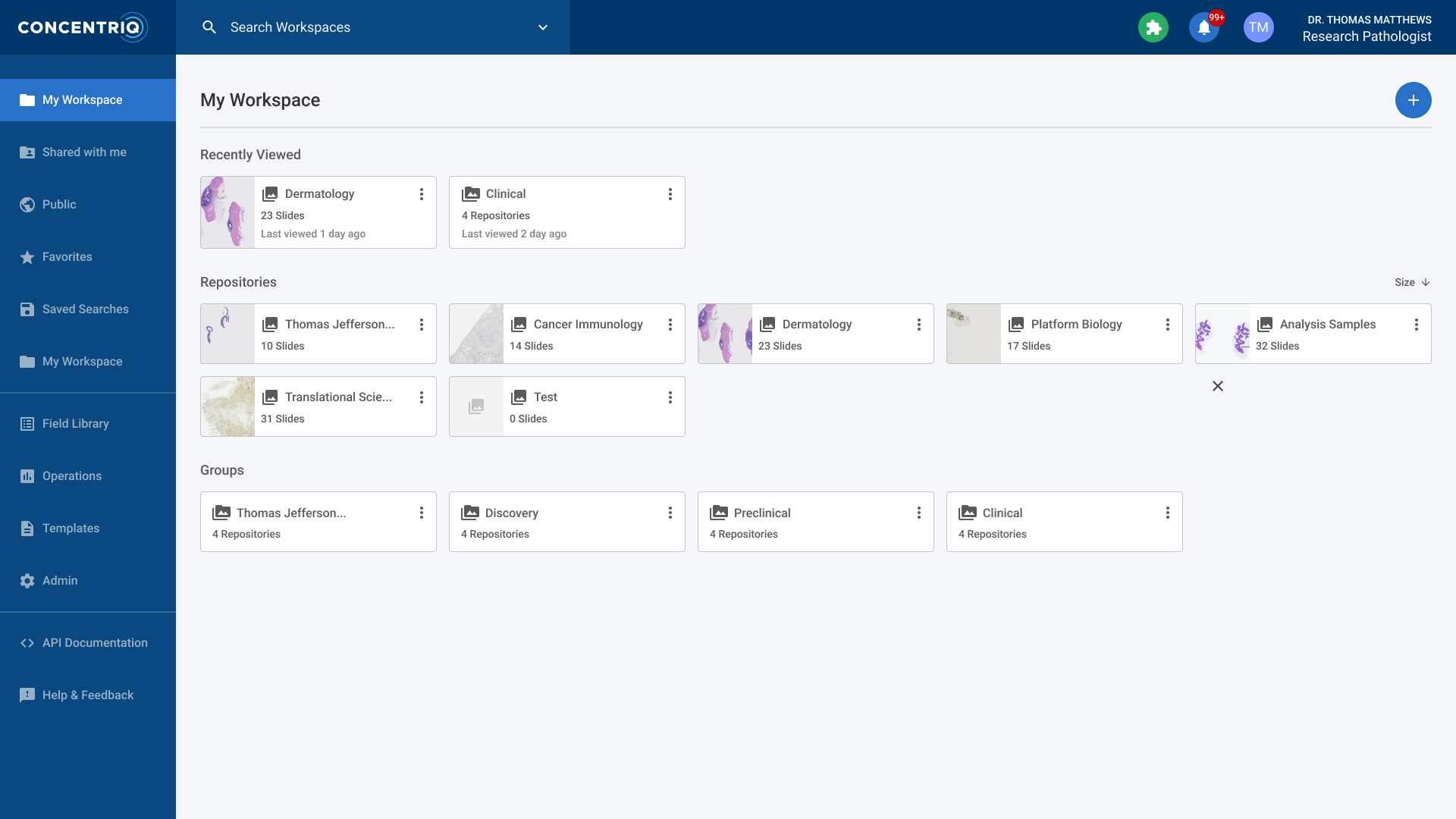
In contrast, the research application’s implementation featured an overwhelming number of navigation options on the main page. The poorly structured taxonomy resulted in excessive clutter, wasted space, and underutilized functionality being placed front and center. This created an underwhelming user experience that lacked clear hierarchy, visual cohesion, and intuitive flow.
Solution
The solution became clear: we would move non-workflow-related items to the user dropdown in the top-right corner. This adjustment paved the way for a more unified UI across both products. While it may seem like a straightforward change, it required careful coordination. QA resources were necessary to ensure a smooth transition without disrupting functionality. Additionally, user guides and release notes had to be updated to inform current users of the changes.
Next steps in evolution
One area where we consistently received significant Voice of Customer (VOC) feedback was the need for dual monitor support and a more condensed UI that eliminated unnecessary white space. This feedback presented a valuable opportunity to enhance the UI and aligned perfectly with our goal of creating a unified product experience. In the current UI, only a single monitor was supported, resulting in a cluttered interface and limiting the product’s flexibility.
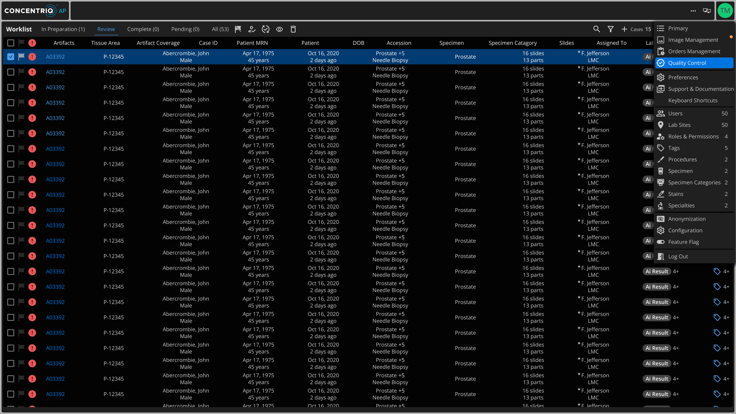
Monitor 1 (Workspace)
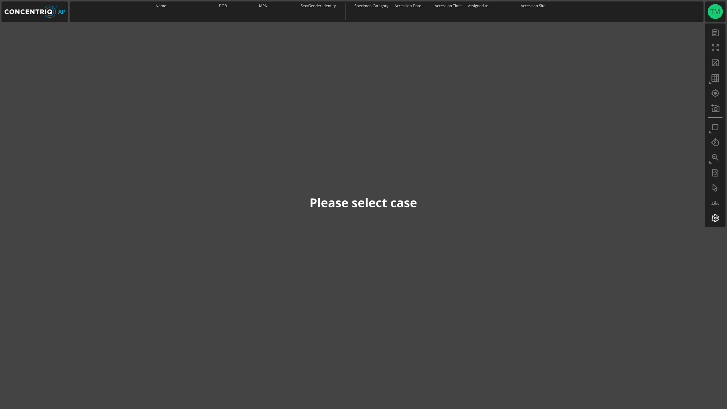
Monitor 2 (Viewer)
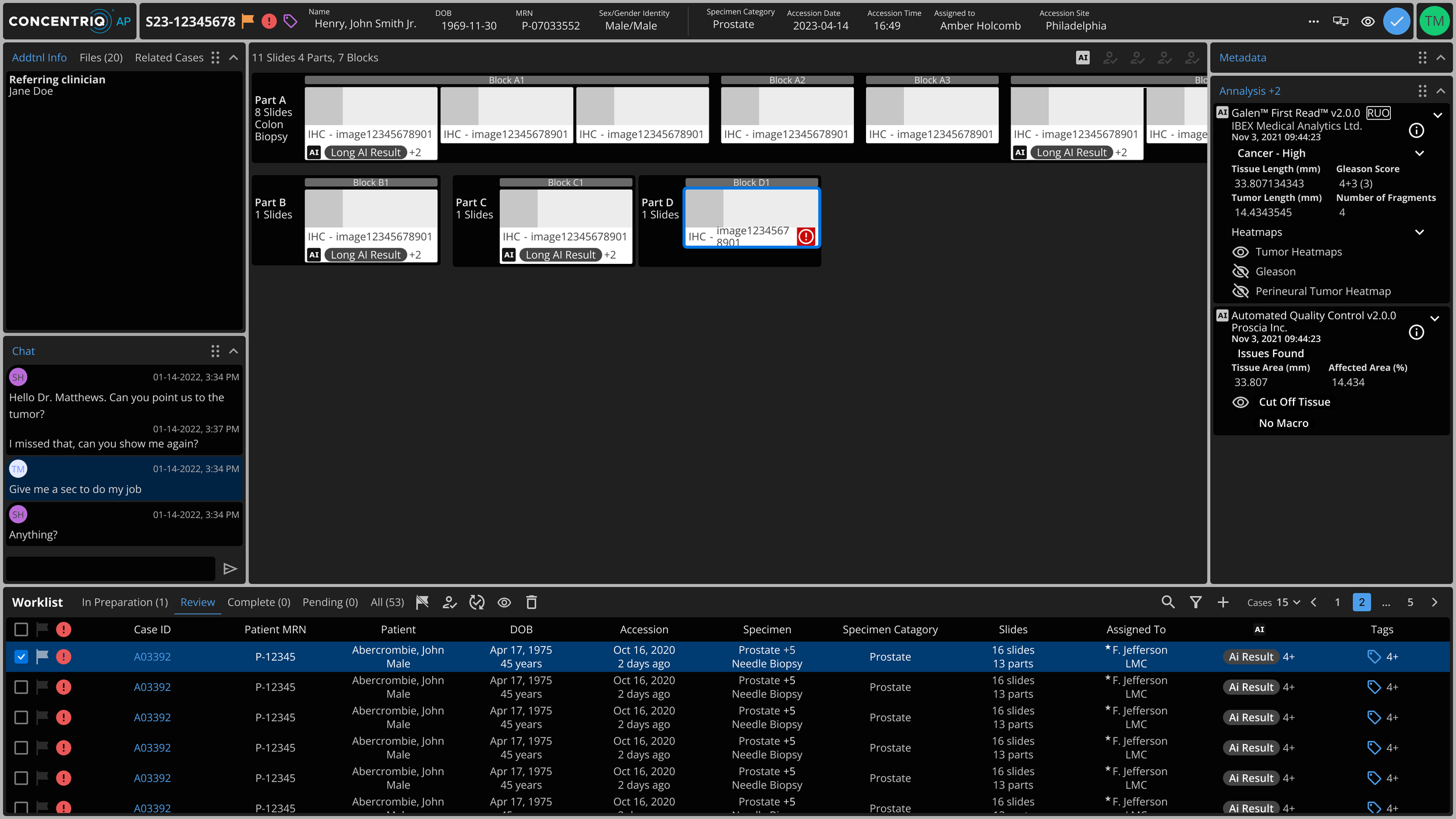
Monitor 1 (Open Case)
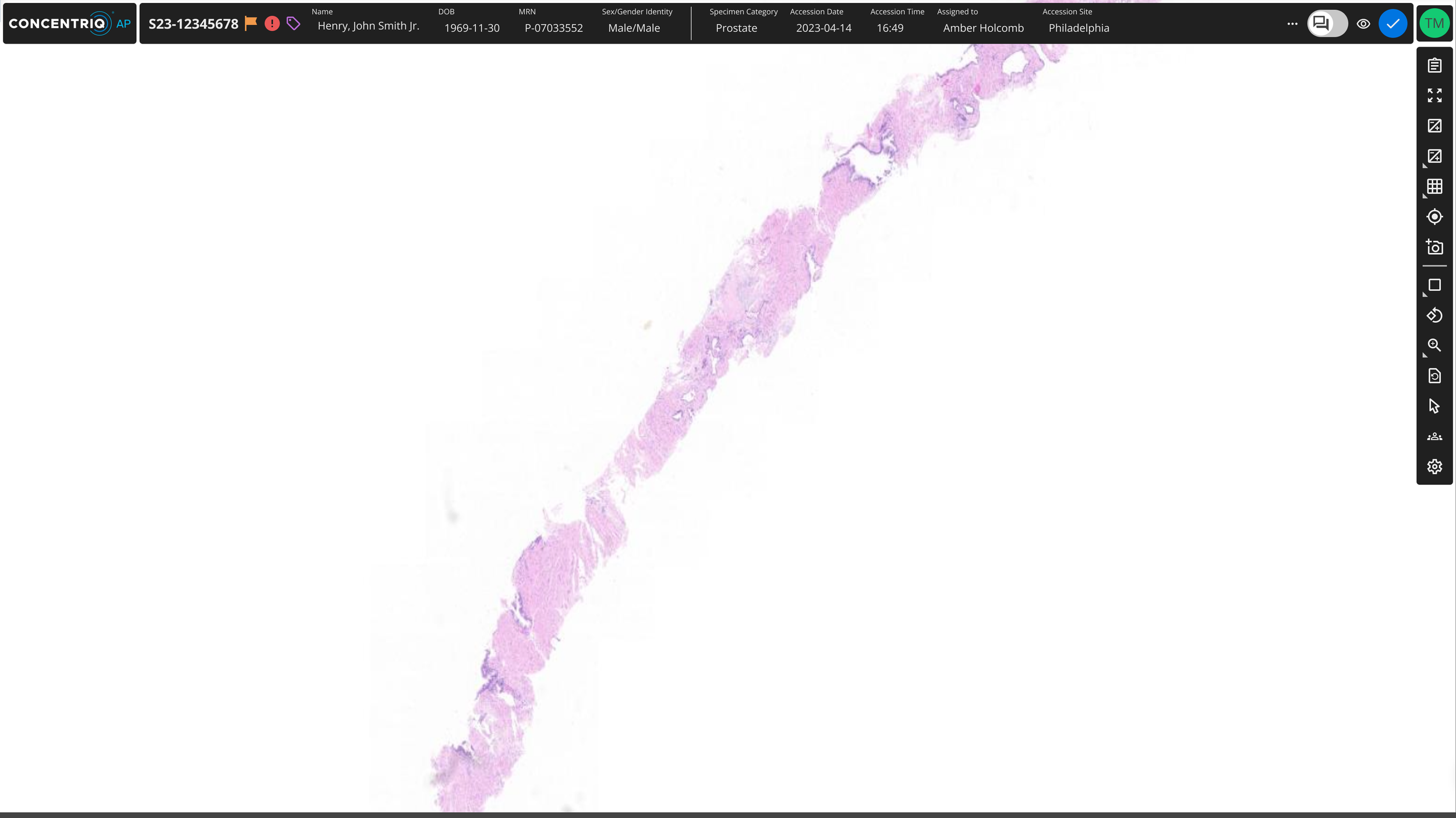
Monitor 2 (Open Case)
We took things a step further by rethinking the left-side navigation panel, which was occupying valuable screen real estate. Based on user analytics, we found that most users rarely used the navigation panel to deviate from their primary workflow. This insight allowed us to move those navigation items to a dropdown menu under the user’s avatar in the top-right corner. As a result, we created an edge-to-edge layout that maximized the display of critical case information, enabling users to make more informed decisions efficiently.
Modular windows
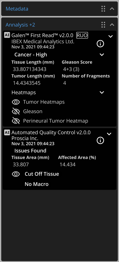
Incorporating modular windows within the UI offers users enhanced flexibility and customization, empowering them to tailor the interface to their specific workflow needs. By allowing users to move, resize, and organize windows based on their preferences, the system supports a more streamlined and efficient workflow. This approach gives users the ability to place critical information or frequently accessed tools exactly where they need them most, minimizing distractions and unnecessary navigation.
The modular design also promotes adaptability across different user roles and tasks, ensuring the interface can evolve as workflows change or as new tasks are introduced. This level of customization not only improves productivity but also increases user satisfaction by providing a more personalized and intuitive experience, aligned with each user’s unique requirements.
the viewer
By moving less critical windows or tools to a secondary monitor, we created an unobstructed view of the viewer, allowing users to focus fully on their tasks. This approach declutters the workspace, ensuring that the most important visual information—such as tissue samples, annotations, and diagnostic data—remains central and easily accessible.
This clean, distraction-free interface enables users to work more efficiently, particularly in tasks that demand attention to detail, such as reviewing pathology slides. The secondary monitor setup allows users to keep supporting tools or reference materials available without overlapping or crowding